For Tomorrow's Creative Business Leaders
Led by pioneering designer and CEO Maria Giudice, Hot Studio helps teams and leaders discover their own path to success.


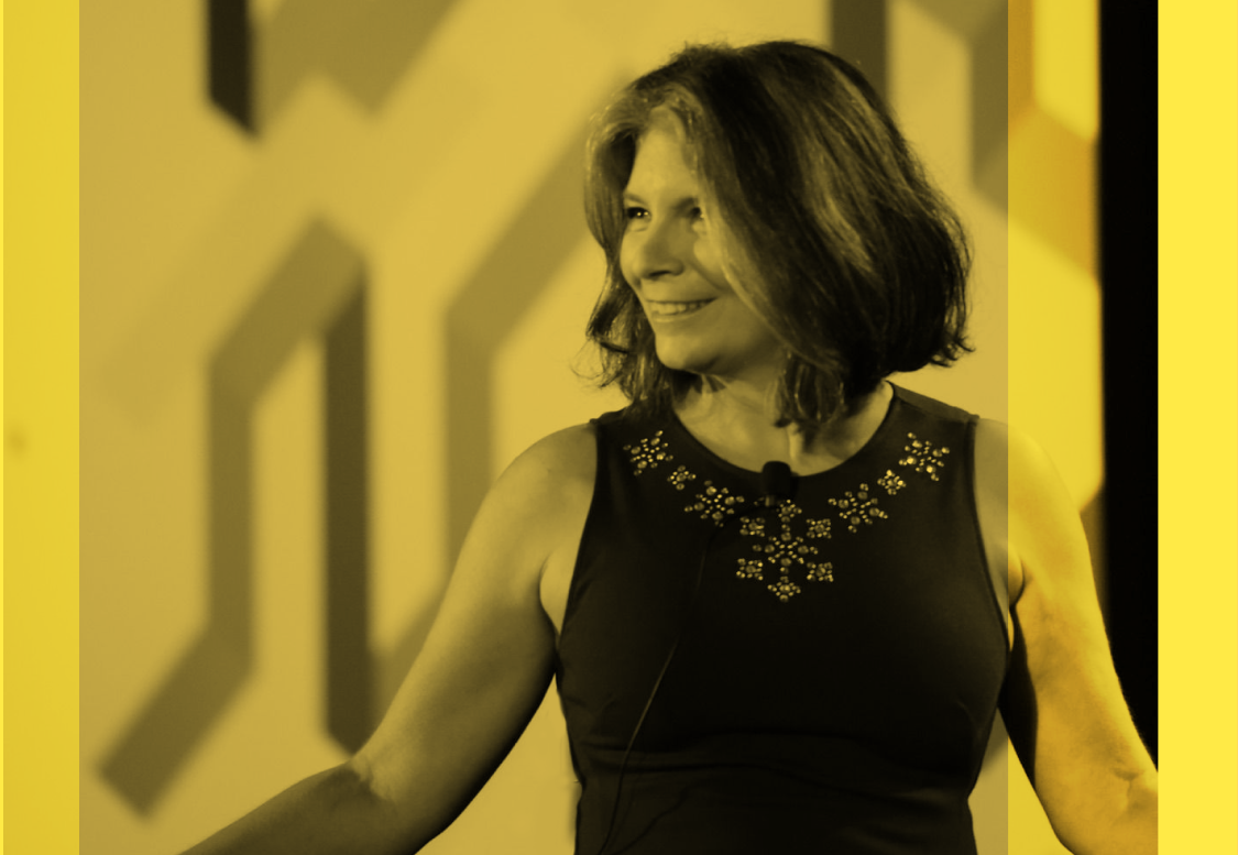
Led by pioneering designer and CEO Maria Giudice, Hot Studio helps teams and leaders discover their own path to success.


 Maria has been an invaluable Design Mentor to Opendoor. During a period of rapid growth and change, Maria coached our designers, improved our processes, elevated design culture, and served as an amazing thought partner.
 Maria's clear and direct communication style, coupled with extensive design and business experience, allows her to articulate frameworks and strategies that clarify desired outcomes, set expectations and get results.
Maria is a hard worker. She’s honest, beautiful and creative. She’s my daughter.
Maria's clear and direct communication style, coupled with extensive design and business experience, allows her to articulate frameworks and strategies that clarify desired outcomes, set expectations and get results.
Maria is a hard worker. She’s honest, beautiful and creative. She’s my daughter.
